Our surveys are crying for help. They are generating unreliable data (often without companies knowing) and are miserable to take.
Most likely (and sadly) you’ve been the recipient of some unwieldy surveys yourself…
So you get that the survey experience is often undesirable.
What we may not think about as much is why bad surveys are a HUGE problem.
A horrible survey experience actually does the opposite of your intent — not only does it generate crappy, unreliable feedback, but it damages your brand.
To help you recognize bad and good survey examples (and figure out how to improve your own user research), we’re launching a survey teardown series…
And while I feel a little odd discussing a specific company and example, talking about something concrete beats the pants off abstract theory.
It’s probably why it’s a safe bet that you’ve seen Val Geisler and Samuel Hulick’s teardown pieces (also my inspiration) floating around the web. Teardowns are a great learning method.
So how did I land on LinkedIn’s November Research Survey for the first survey teardown?
No reason other than circumstance — it was the first survey that popped into my inbox once we decided to start the survey teardown series.
User Research Optimization
Yes, user research optimization is a thing… a thing worthy of your attention.
I know you get how important the user experience is. Because a ybetter user experience is a money printing machine. And if you need a reminder, check out this.
And I bet you know how valuable customer feedback is.
So you, like many companies, rely on surveys to get you that customer feedback, perhaps even as your top user research and voice-of-customer source.
Yet, I’m sorry to say, most surveys provide a horrendous experience for the survey taker.
So while we optimize our product(s), marketing, and growth machines, we sometimes forget to optimize the feedback machinery that sustains and propels every other optimization we do.
User research optimization is the practice of generating better feedback, data, and insights while delivering a superior experience for your users.
Survey optimization means optimizing your surveys for not only the insights you need (i.e. making sure you get the data you actually need in a reliable and accurate manner), but also for the survey taker’s experience participating in your survey (i.e. user experience).
Unfortunately, LinkedIn might have skipped a bit too much optimization with a recent research survey.
LinkedIn Survey: The Good, the Bad and the… Wow, Really?
We all know and (probably) use LinkedIn. They were acquired by Microsoft for $26B and a pioneer in the social media wave, so I am automatically intrigued when a LinkedIn user experience survey hit my inbox. Unfortunately, that feeling doesn’t last long, as my intrigue quickly turns into some head scratching.
Overall, it’s a decent survey and many of the issues have easy fixes, so let’s break it down step-by-step.
The Good
Good subject line, thoughtful question design is evident, and includes open-ended question(s).
1. The subject line is flattering and clickable. I love being an expert!
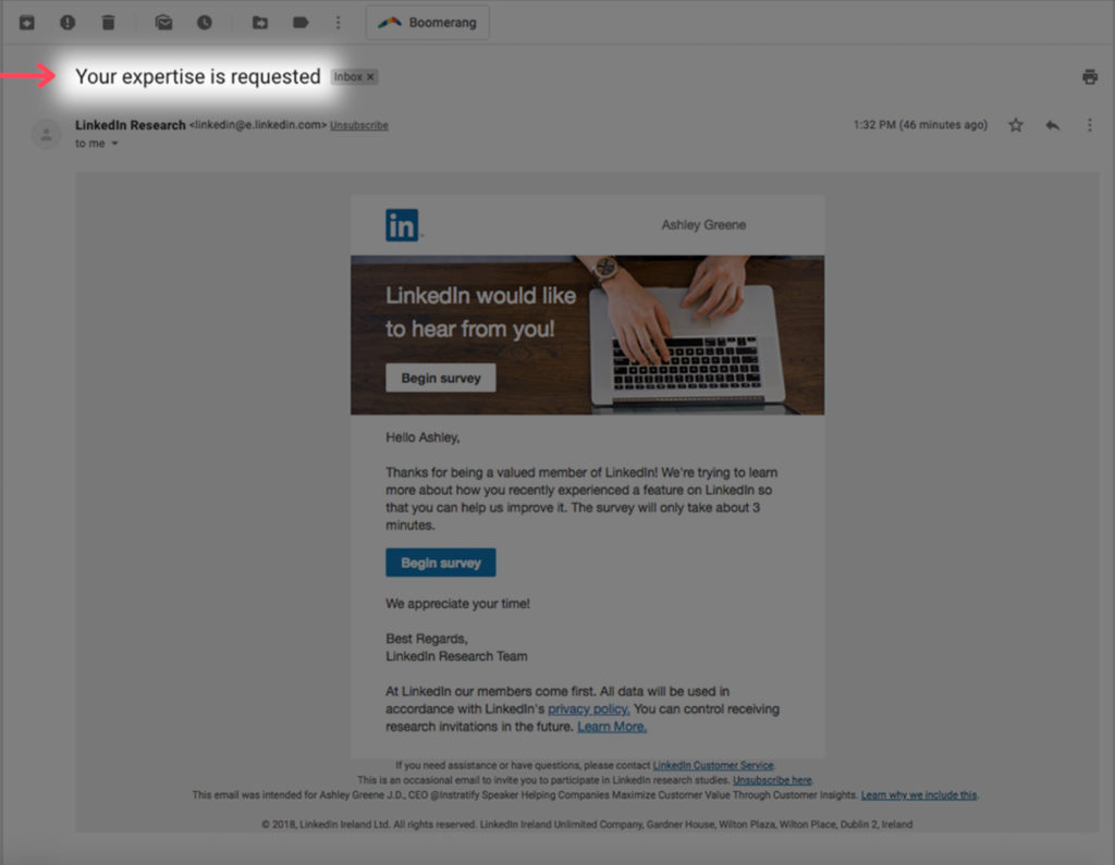
Asking for my expertise, and then using my name in the body of the email, gets a big double thumbs up. We’re starting out good.
Yes, name personalization is pretty basic at this point, but still necessary as personalization can provide a better experience and give you an almost 10% increase in survey participation rate.
Furthermore, asking for my expertise, instead of some generic (and unadvised), “will you take this survey?”, is a great way to optimize the survey for both participation and user experience.
This phrasing is flattering. Being thought of as an expert is a good feeling. And from a well-known successful company like LinkedIn?
Even more flattering.
And also true… because your customers are, in fact, the experts.
As a rule of thumb, flattery will get you places in terms of providing a superior survey experience.
2. Telling me how long the survey will take AND that the survey will take only 3 minutes.
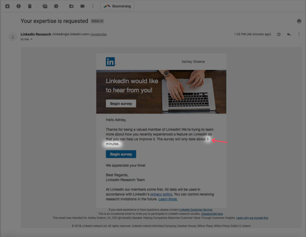
A 3-minute survey? Yes!
The shorter the duration of the survey, the better data you will collect. And LinkedIn’s 3-minute survey is right in the sweet spot. It balances your need to get information with providing a better user experience.
Plus, letting me know at the start exactly how much time it will take is a great practice.
The caveat is that your estimate needs to be accurate. Was this 3-minute estimate accurate? You’ll have to wait and see. 😉
Not sure how long your survey will take? Tools like Survey Gizmo (pictured below) offer an estimate for completion time and cognitive load for the survey taker.
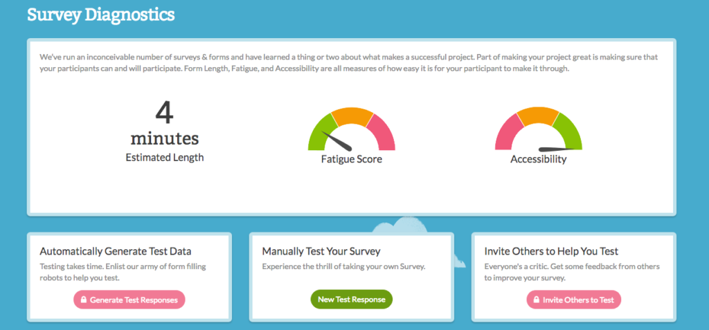
I always like to be conservative (with survey duration estimates, that is) and usually add a minute to the tool’s estimate. For example, here I’d let users know this is a 5-minute, rather than a 4-minute, survey.
Customer surveys should NEVER be longer than 3-5 minutes. Otherwise, everyone suffers: your users suffer through a miserable experience and you get crappy data.
For instance, Survey Monkey’s study of 100,000 randomized surveys found that surveys longer than 5 minutes suffer severe diminishing returns — i.e. your data will suffer in terms of quality and reliability. Yuck.
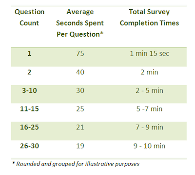
Image Source: Survey Monkey
And this study didn’t even take into account the risk of annoying your customers if you tell them up front the survey’s shorter than it actually is.
You do not want your customers leaving your survey feeling upset and frustrated, or worse, deceived — so, let’s just all agree to follow this 5-minute rule for surveys.
Ok?
3. The survey starts off easily enough.
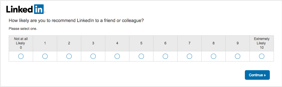
The LinkedIn survey is off to a decent start with a relatively easy-to-answer (i.e. low cognitive load) NPS question. This is good.
Because if the first question requires a high cognitive load (i.e. more effort), most participants will fly the coop.
Could this be an even lower cognitive load question?
Absolutely. I actually like their second question better for this.
However, it’s important your first few survey questions balance being low cognitive load questions with feedback priority, as survey takers will spend the most time per question at the beginning and survey exit rates increase with each additional question.
So I see this Net-Promoter-Score question as an okay compromise.
Why is a low cognitive load question critical in the first question or two?
Because it’s one of the biggest factors to increase completion rate — heck, even partial completion rate — because of our human desire to finish something we start. We also call this completion bias.
Completion bias is an inherent human trait that suggests we are all more likely to finish something we’ve already started. Getting the user started on the survey is the critical step here.
There’s no better example of example of completion bias in action than IKEA.
Think of the last time you had to build a piece of IKEA furniture…
You bought the cheap coffee table, you brought it home and started building. Maybe they didn’t give you enough screws/washers/whatever.
And those darn directions with only images, no words.
Chances are you might just be maddeningly frustrated… but do you stop?
Maybe for a break.
Or a drink.
But do you stop and never start again? Likely not. You want to see it through. You need to see it through. You have an inherent drive to reach the finish line.
Having a low-cognitive load first question is a great survey design technique because it plays into completion bias… increasing your completion rate and response quality.
So you might be wondering… what is a low cognitive load question exactly?
Good question. It’s an easy-to-understand question that doesn’t require much effort for the survey taker to answer. Often, lower cognitive load questions take the form of a multiple choice*, true/false, or yes/no questions.
4. Great, just one question per page. Thank goodness.
Good. This looks like a multiple-page survey design.
Research results are mixed on whether one question per page (multiple-page survey design) OR multiple questions on a single page (single page survey design) is better. That said, I almost always recommend the multiple page survey design, especially if we’re keeping our surveys in 3-5 minute sweet spot.
5. Question order seems to consider user cognitive load and effort, at least in the beginning.
As we discussed above, this survey starts off with relatively easy questions. Great. But let’s look beyond the first couple of questions now in terms of question type and question order.
Overall, LinkedIn is adhering to a survey design practice that alternates a high cognitive load question (e.g. an open-ended question, ranking/rating scale, MaxDiff question types) with a low cognitive load question (e.g. most multiple choice, true/false, yes/no question types).
This alternating strategy generally keeps the user more engaged and decreases perceived effort, increasing completion rate, response quality, and user experience.
So how does this alternating survey design strategy generally work?
If you have a 10-question survey, then:
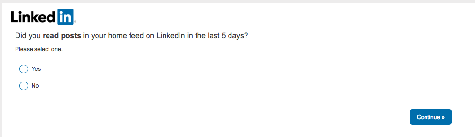
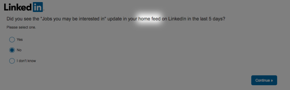
- Have your first question or two be easy, low cognitive load questions. LinkedIn does that here. This is a good time to ask segmenting questions like they did. Here, LinkedIn asked an easy yes/no: “Did you read posts in your home feed on LinkedIn in the last 5 days?” as their second question.
- Make your third question the single most important question if you couldn’t do it Question #1 or Question #2 due to it’s higher cognitive load.
- For questions 4-8, alternate a higher cognitive load question with a lower cognitive load question. Continue to front load the higher priority questions.
- Questions #9 and #10 (and sometimes #8) should be back low cognitive load questions again to encourage survey completion.
I often add at the very end — making blatantly clear its optionality — this open-ended question: “Is there anything else we should have asked?”
6. Use open-ended questions!
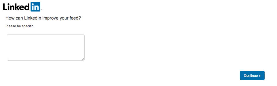 Most big company surveys omit open-ended questions because analyzing them takes significantly more time.
This is a fair point. But also a HUGE mistake.
Including at least one or two open-ended questions is invaluable — even if a full analysis is not able to be completed.
You’ll never find out what you don’t know you don’t know UNLESS you use open-ended questions as well (it’s also why one-on-one customer interviews are the best user research method, but more on that in another post).
So, even a cursory glance at the open-ended question responses is better than nothing and will give you some insight. Plus, even without a full open-ended analysis, you can still run a sentiment analysis, pull messaging and copy, plus a plethora of other actionable items.
And, as much as we try to write questions that are not biasing, a multiple choice question is by nature a leading question. Open-ended questions allow for data which are less influenced by survey design.
I suspect that’s why LinkedIn, who sent this survey to a large group of users, included at least one open-ended question here. And deserve a big pat on the back for that!
The Bad
Lack of personalization and incentives.
1. Sent from a robot — i.e. a corporate department, not a real person.
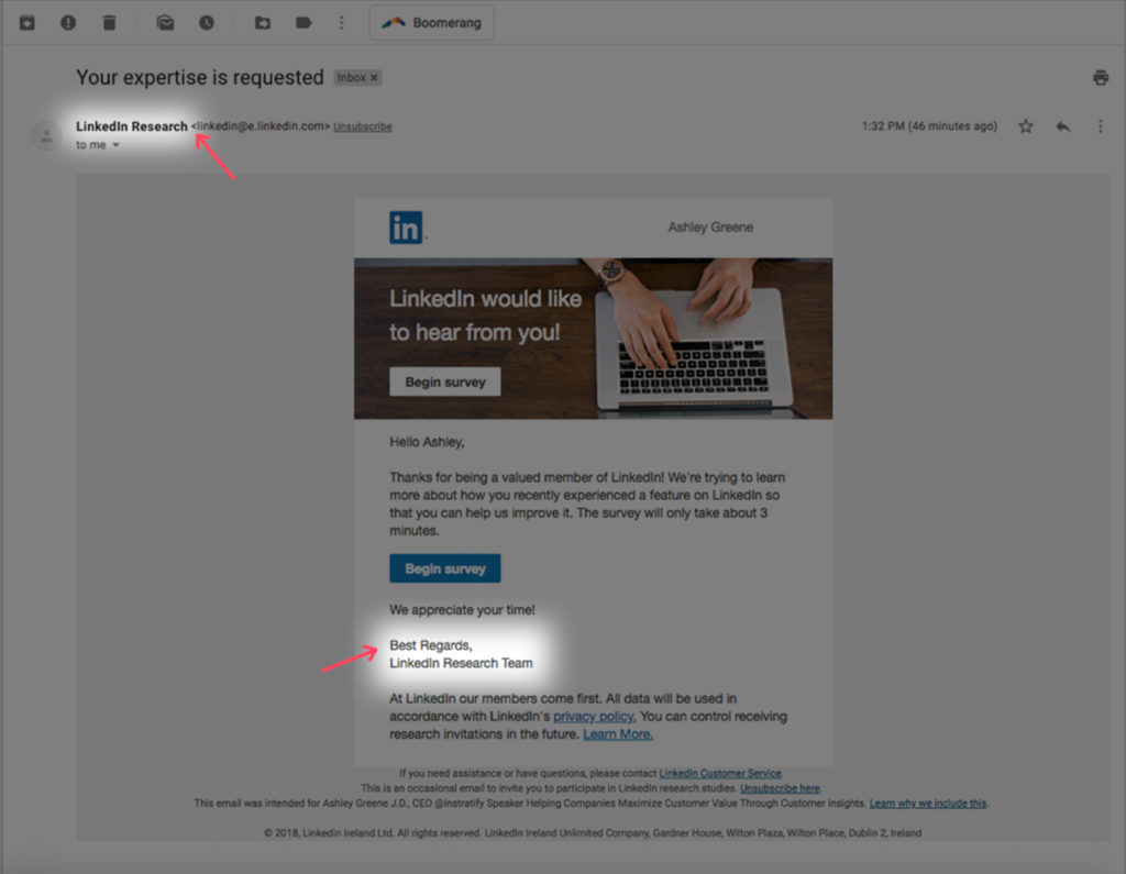
The connection I felt from my name being used is immediately countered by the sender being “LinkedIn Research”. This is boring and impersonal. Research shows emails sent from a person are more likely to be opened. And the more “important” the sender is perceived to be, the better.
While signing off with Jeff Weiner might not be necessary (although recommended), customer research emails should (at least appear to) come from a person at the c-suite level.
And if you’re using an email style that supports mark up, including an image of the sender in the signature is a good practice as well.

2. A somewhat narcissistic survey invite email.
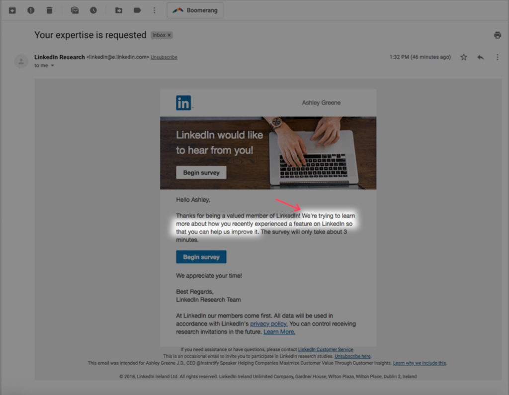
“We’re trying to learn more about how you recently experienced a feature on LinkedIn so that you can help us improve it.”
The email starts with asking for my expertise (yay!), but what happened? Am I now simply giving feedback, out of the goodness of my heart, that likely will never be read?
There appears to be no benefit for me in this email, the survey taker, whatsoever except an altruistic one. Rather the benefit is for the company only — how they CAN improve. But why do I care unless I’m feeling charitable?
Is this a completely altruistic ask? Then admit it. Play up the charitable angle.
If not, show how giving feedback via the survey will benefit the survey taker as well. Plus, your users will most likely choose to participate based on peripheral information rather than the survey itself. Survey design should take this into account and do its best to draw users in.
So, how do you give adequate incentives without resorting to cash and gifts, which I recommend avoiding if at all possible?
In other words, what could LinkedIn have done better in this survey?
Often just one or two sentences explaining why this feedback is being collected and showcasing the benefit(s) to the survey taker can increase both survey participation rates and brand goodwill.
Here, they could have explained for instance how giving feedback via the survey:
- Could allow them to play a substantial role in shaping the company’s future or a new feature; and/or
- Would help them continue their mission to serve and delight their users, and the only way they can do that is by listening to their feedback and needs, highlighting how important surveys are and how exactly they’ll use the feedback; and/or
- Is just a plain ol’ favor (based on the persuasion principles of reciprocity) and even offer them a favor in return.
3. A boring call to action (CTA).
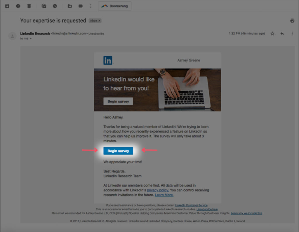
The CTA is an uninteresting and unenticing — a boring “begin survey”.
At the end of the day, you’re trying to persuade someone to do something — just like you are with your marketing website and within your product. But in this case, instead of getting someone to sign up, it’s to acquire critical data to drive decision-making and growth!
Here, even without going all copywriting ninja (which is ideal), LinkedIn could have gone with something generic like “Share Your Opinion Now” or just “Take The Survey” or “Access The Survey”. Any of these would be better than “Begin Survey”.
This isn’t all that bad. But does get a bit worse.
Wow, Really?
Some things, unfortunately, made me scratch my head.
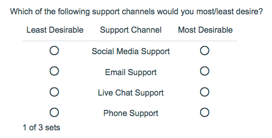
1. Beastly questions
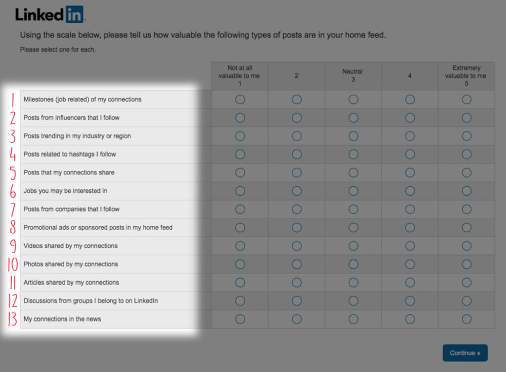
My first thought when I see this is…
Yikes.
Will the average survey taker answer all of these accurately?
Likely not.
Will some survey takers see this unwieldy monster and bail… reducing completion rates? Absolutely.
And even if they do stick around, many will likely play eenie-meenie-miny-moe for 50% of the question.
Often worse than not collecting feedback at all is thinking you are collecting accurate feedback that’s actually unreliable. But they are not alone. I see these all too often.
So what could you do instead?
You could optimize the rating question itself OR optimize the survey.
Optimizing the rating question involves some minor tweaks to increase data quality and improve the user experience, whereas optimizing the survey approach would replace this type of numeric tanking question altogether. I recommend optimizing the survey approach, but let’s first start with just optimizing the question that’s already here.
So how could you optimize this question further?
- Limit the rows to be ranked from 13 to 3-5 max per page. And break down those pages by category and indicate the category when possible.
- Give a text description of what a “2” and “4” rating indicates. A text description was there for 1, 3, and 5, but 2 and 4 were missed. Since one of the problems with ranking/rating scales is that they are highly subjective, a text description can be a good design practice.
- Consider reducing the scale from 1 to 5 to 1 to 3. A smaller rating scale is a better experience for the user and gives you more reliable feedback.
Ok, what about optimizing the survey?
Often numeric ranking/rating scale questions like these are vague and arbitrary. And the design can encourage random selection.
I often prefer using a MaxDiff analysis instead of a ranking/rating scale question.
Here LinkedIn could have turned this question into a MaxDiff by turning the rows into attributes and asking:
“Of the following options, what is the MOST valuable type of post in your home feed?”
Followed by…
“Of the following options, what is the LEAST valuable type of post in your home feed?”
If using a MaxDiff question type isn’t possible due to budget or survey software limitations, there is a “cheat”. Use a dropdown single choice selector, ask the survey taker to select an option as best/most/least/worst.
2. Multiple ballooning questions in a row.
We’ve gone over how the numeric rating scale question type could be improved.
Unfortunately, it gets worse. Because there are several multi-row rating questions back-to-back.
Even if ignoring the suggestions I listed above, I would at least try to break up these questions by alternating lower cognitive questions in between to try to improve completion rate, data quality, and the user experience.
3. No progress bar.
Can you see a progress bar? I didn’t anywhere until…

The very last page.
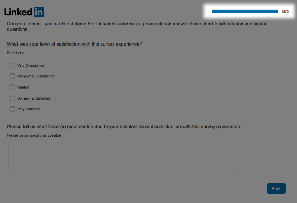
Unless I hit a technical snag (which is quite possible), there was no progress bar visible until the very last question. This would be the least important place for the progress bar.
This really made me scratch my head. I’m hoping it indeed was a technical glitch.
Feedback on survey progress (i.e. a clear indication of progress made) leads users to positive feelings and can reduce the perception of task burden. In other words, including a progress bar is a big must on every page of your survey.
Remember when we talked about completion bias? People need a compass and a finish line. Otherwise, your survey is a black hole, and nobody has time for that.
4. I’ve spent longer than the promised 3 minutes completing the survey. ☹
Of course, I’ve been analyzing the survey, so naturally, it took me way longer than 3 minutes.
By the third rating scale question with 8 rows of sub-questions, I was starting to feel this survey may go on forever. A feeling I’m sure was exacerbated by no progress bar.
But I also did skim and answer the questions, taking the time to write something down for the open-ended ones, mimicking your average ideal survey taker, and it still took a bit longer than 3 minutes.
It is important for us to always calibrate expectations accurately, whether it’s a product promise… or a survey one. Worse than not setting any expectation of duration, is setting an expectation that is unrealistic. It makes users feel distrustful, or worse, deceived.
I know none of us want our users to feel that way… ever. Plus, setting unrealistic expectations also makes it less likely that users will engage in your future surveys.
I don’t think this survey was too far off the estimate here, but I prefer to have a larger margin of error (adding an extra minute to the estimate) since no two survey takers are alike.
5. Inconsistent language.
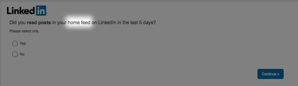
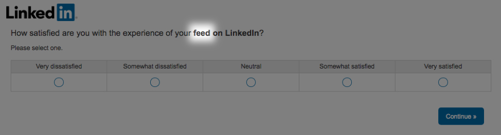
Question #2 uses the term home feed while Question #3 refers to your feed. And then again Question #9 says home feed.
Are your feed and home feed the same thing?
I use LinkedIn a lot and even I’m not 100% sure.
When constructing survey questions, you want to be consistent with your terminology throughout and always phrase each question in its most simple form. Basically, could a third-grader understand the question and apply the terminology consistently? If not, keep editing.
This a time when it is a-ok to be basic.
So why is using consistent and easy to understand language critical in surveys?
Inconsistent and overly complicated language decreases perceived authenticity and professionalism (bad for your brand), poor wording leads to misunderstanding (bad data), and increases the cognitive load of users (crappier user experience).
Let’s Make Great Surveys the New Norm
It’s not often I see a survey that delights a #surveynerd like me (although CXL did one in December that was pretty darn good. It’ll be a future teardown — I promise). This LinkedIn survey here had some high and low points. Overall, it was a fairly average survey.
In general, there are important themes to remember when creating a successful survey: (1) structure; (2) clarity and consistency; (3) question type order, and cognitive load; (4) user experience; and (5) presentation.
Unfortunately, bad surveys are the standard — not the exception — across almost every industry.
I’m hoping we can change that.
Because surveys are awesome — they can make users feel like they matter and at the same time give you accurate data at scale that other research methods cannot.
… Surveys can fuel you with the customer insights needed to stay ahead of the competition.
… Surveys increase organizational efficiency by reducing the number of expensive, ineffective ideas, campaigns, features, and products implemented.
… Surveys keep you close to the customer, so you can keep serving and delighting them increasing loyalty, referrals, lifetime value, and retention rates.
And remember, if nothing else, inaccurate feedback is way worse than no feedback at all.
People are often surprised to hear me say that, which is why I’ve harped on data quality so much here. I’d much rather you collect no customer feedback or data at all than make critical decisions off bad feedback thinking it’s good feedback.
So let’s make good surveys the new norm, together.
P.S.
Many sources I rely on here are academic journals. This also means that unless you have journal subscriptions, you may only be able to view the abstract.
Why academic journals?
One thing I see too often in the blogosphere, is linking to other blogs as the “end-all-be-all” sources of truth. Don’t get me wrong, I turn to blogs all the time and they can be great sources. But only citing blogs, or citing another blogs’ opinion as a source for fact is a disturbing trend that I’m hoping we can reverse. 🙂